After editing we will be presenting the work as an editioral. For this we were deciding how to present it as an editorial. We had to pick a title and looked at examples of how we could present it. Firstly Steph came up with these ideas for presenting:


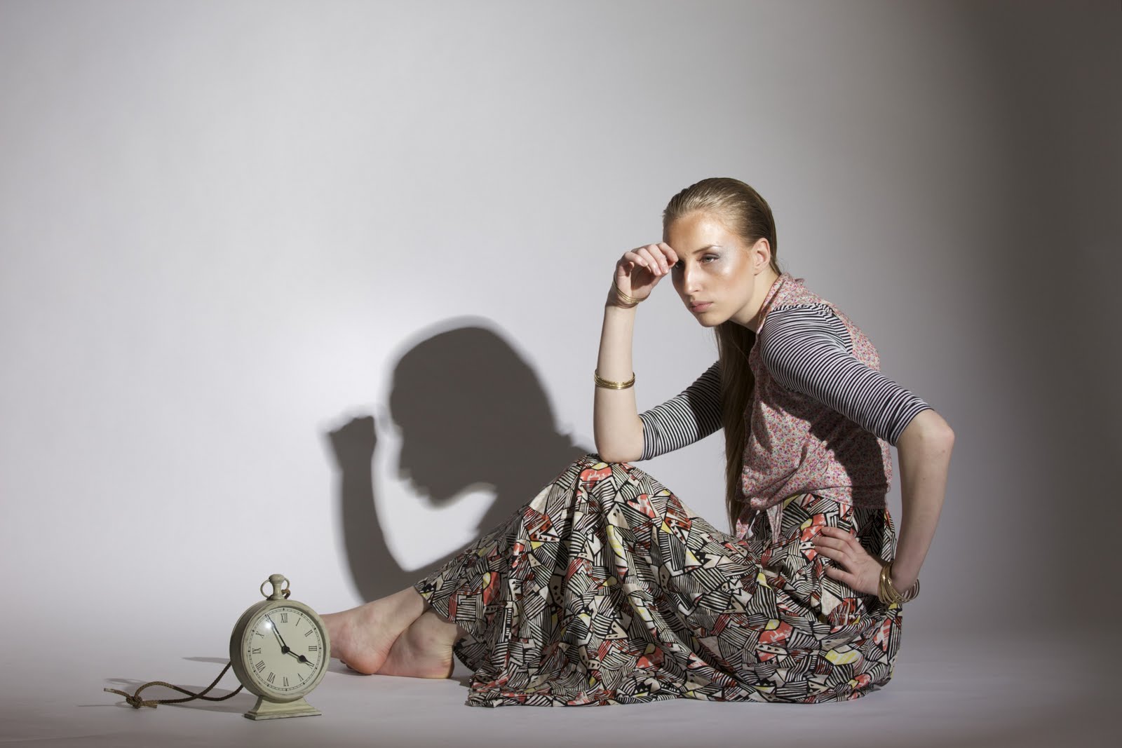
 When Steph was first putting the images together into the layouts, she came up with the title 'Tick Tock' as we have a clock in some of the images and it sort of linked with our theme.but I suggested that the title didnt realy convey our idea well and the clock was used as a prop to help the story, not the actual theme and so I suggested that we come up with something to do with being creative and so we came up with the title 'The Creative Manifestation'. Steph looked into some font types and emailed us, myself and Fay both agreed with the font that was selected and I think it works well with the actual title as it looks more creative ans stylised than the previous.
I like the top layout the most but I prefer it with a white background as the images stand out more and I think this looks more like a professional editorial that you would see in magazines.
After looking at the editorials, we realised that this would only cover two pages, although it does contain 8 images, it would actually only be a two page spread and so we decided to have the images as full page spreads for each image.
Firstly we looked at editorials to give us some sort of inpriation. We didnt want anything fussy as this would detract from the images so we settled on whether to include borders or not and what colours to use if we did. Here are some examples I looked at as research:
With Borders:
When Steph was first putting the images together into the layouts, she came up with the title 'Tick Tock' as we have a clock in some of the images and it sort of linked with our theme.but I suggested that the title didnt realy convey our idea well and the clock was used as a prop to help the story, not the actual theme and so I suggested that we come up with something to do with being creative and so we came up with the title 'The Creative Manifestation'. Steph looked into some font types and emailed us, myself and Fay both agreed with the font that was selected and I think it works well with the actual title as it looks more creative ans stylised than the previous.
I like the top layout the most but I prefer it with a white background as the images stand out more and I think this looks more like a professional editorial that you would see in magazines.
After looking at the editorials, we realised that this would only cover two pages, although it does contain 8 images, it would actually only be a two page spread and so we decided to have the images as full page spreads for each image.
Firstly we looked at editorials to give us some sort of inpriation. We didnt want anything fussy as this would detract from the images so we settled on whether to include borders or not and what colours to use if we did. Here are some examples I looked at as research:
With Borders:


 These are all editorials with borders, I like these because it makes the image stand out and frames it. I like the image with the black lined border, but I dont think this would go with the images we have.
Without Borders:
These are all editorials with borders, I like these because it makes the image stand out and frames it. I like the image with the black lined border, but I dont think this would go with the images we have.
Without Borders:


 I do like the images without a border but it would mean that one of our landscape images would have to be a double page spread and I dont think it would loko as good as a double page spread as it would cut the image in half, I think that would look more successful as an a4 image and have a large border on it.
Here I have looked at some images that dont have a border but it has a lot of plain background, so it sort of frames the model:
I do like the images without a border but it would mean that one of our landscape images would have to be a double page spread and I dont think it would loko as good as a double page spread as it would cut the image in half, I think that would look more successful as an a4 image and have a large border on it.
Here I have looked at some images that dont have a border but it has a lot of plain background, so it sort of frames the model:


 These are a lot like our images so they do look quite successful without a border and there is space for titles or credits, but I just dont think they look as good as the images with broders that I looked at previously.
We deliberated and decided that the images do look better with borders, we then had to decide on the titles placement on one of the images, whether to include credits and pages numbering.
We decided that the best image to include the title would be the landscape image, as we are using this as an A4 image, there will be a large border and we think it would look better having the title on a border rather than on one of the images.
Steph asked us whether we wanted to include credits, myself and Fay thought that this would detract from the photographs and didnt think they really needed credits, instead we opted for including page numbers. When Steph did the editing, she put the numbering on the side which I actally really like. I think its different and it has been finished with a really high standard so looks very professional.
I think when it came to editing this time, we all had a lot of imput that was maybe not the case in the last project and so now I think we've been left with some really good images that could actually appear in a magazine. Steph did a really good job editing the images, the only flaw maybe is that some of the make up lokos a litle too orange in some of the images after editing, but that is down to myself and Fay as we thought it would appear lighter under the lights and flash.
These are a lot like our images so they do look quite successful without a border and there is space for titles or credits, but I just dont think they look as good as the images with broders that I looked at previously.
We deliberated and decided that the images do look better with borders, we then had to decide on the titles placement on one of the images, whether to include credits and pages numbering.
We decided that the best image to include the title would be the landscape image, as we are using this as an A4 image, there will be a large border and we think it would look better having the title on a border rather than on one of the images.
Steph asked us whether we wanted to include credits, myself and Fay thought that this would detract from the photographs and didnt think they really needed credits, instead we opted for including page numbers. When Steph did the editing, she put the numbering on the side which I actally really like. I think its different and it has been finished with a really high standard so looks very professional.
I think when it came to editing this time, we all had a lot of imput that was maybe not the case in the last project and so now I think we've been left with some really good images that could actually appear in a magazine. Steph did a really good job editing the images, the only flaw maybe is that some of the make up lokos a litle too orange in some of the images after editing, but that is down to myself and Fay as we thought it would appear lighter under the lights and flash.